Throughout this school year, I have been thinking about how content is shared with students. Before any 1:1 program, we as teachers would put something together in a Google Doc (or lets be honest and say Microsoft Word) and print the document out for each student. You might have tried to keep text to a page. Very little graphics, if any, were included.
Fast forward to today where students have a device. We can think about creating and designing content on a document that has more of a design element to it.
At the beginning of the school year, I was fortunate to participate in a YouTube Live conversation with Lisa Highfill and Kelly Hilton, co-creators of the term Hyperdocs. You can watch the recorded conversation HERE. I also previously wrote a blog post about Hyperdocs which can be found HERE. Basically, their main objective with hyperdocs is to help guide students through an informal, reflective journey. This can be accomplished through the following steps: Engage, Explore, Explain, Apply, Share, Reflect, and Extend. More information can be found on the hyperdocs website.
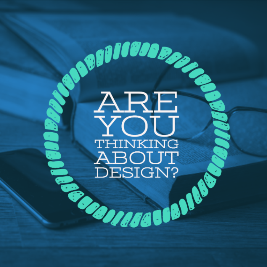
There are times however where you don’t want to create a hyperdoc for students but still need to share information. This is where an element of design, in terms of layout, color, and style come into play.
It is important to note that there is not one ‘right way’ of putting information together. The whole point of this blog post is to help people think about how they are sharing information to others.
- Should everything be in Times New Roman font, size 12, black font?
- Should there be some color?
- Should tables be involved?
- Should a different file type be used besides Google Docs?
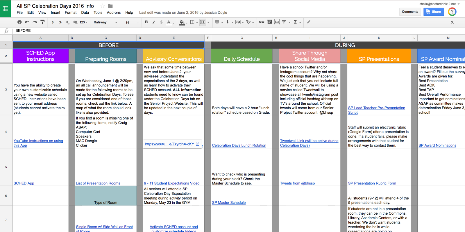
This year, the decision was made to organize the information differently to help staff out. Again, keeping in mind that the committee didn’t want to send several emails out, they decided to put all of the information together in a Google Drawing.
Both the Google Sheet and the Google Drawing share the same information – it is just presented differently. Each file had links that opened up different files. Ask yourself, which would you rather look at? Your answer might be different from a friend of yours. I hope however, you think to yourself, how can/should I share information out with students beyond just typing text.
Version 1 (White background with black text)
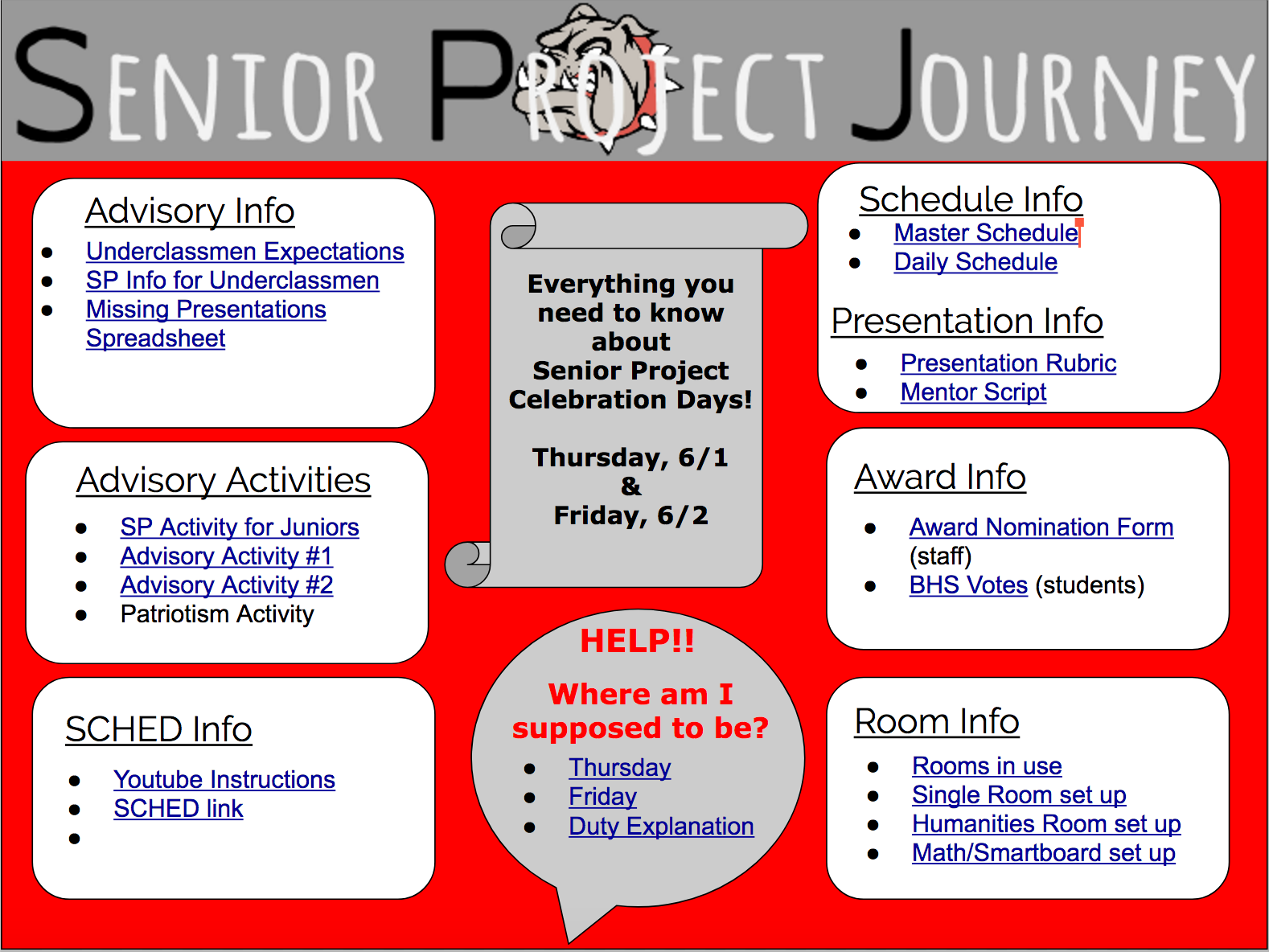
Version 2 (Purple background, with tables, different font)
Version 3 (Circular workflow process table, with different font and colors)
I know…I don’t have the all the answers or the ‘right way’ of putting content together. Hope that this has gotten you to think about design however. If you have any questions or you would like to talk about this topic with me, you know where to find me.
It all comes down to design! And that is my Spiel…