
 For our final day of 10 Days of Google, we are going ‘back to basics’ with Google Docs. We are at a point now where not a day that goes by that we don’t open up a Google Document. Well, here are three tips that can help enhance the look of your documents.
Location of Images
Do you ever find that when you add an image to a Google Doc, it does not go where you want it to go OR you find that you can’t have it exactly in the spot that you want it? Well, have no fear! The default for all images that are added to a Google Doc is set to ‘inline’. You must make the change to allow more freedom for the image to move anywhere in the document.
- Select the image that has been inserted in the Google Doc
- Choose wrap text – this will allow the text to exist right next to the image.
- Click and drag the image to where ever you want it be located.
Response Boxes
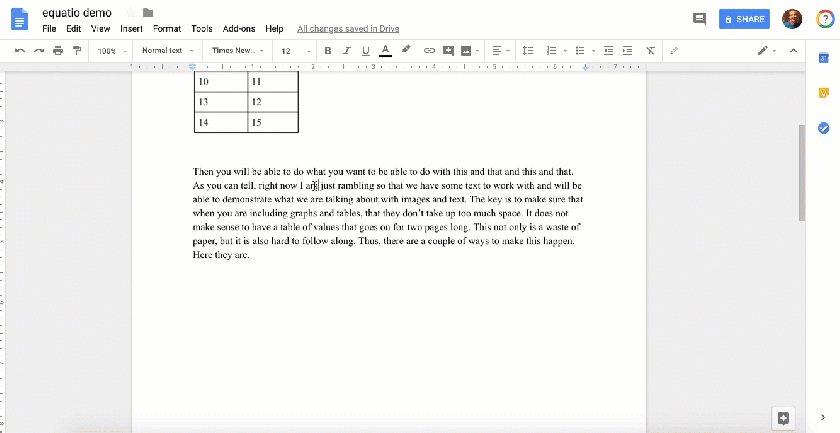
Find it necessary for students to type responses in a Google Doc? Why not create response boxes. These can be a great way to provide guidance for students in terms of where to respond to questions. The trick all lies in creating a 1 x 1 table, where I get rid of the borders and change the color of the box. You can also be fancy and change the text inside of the box to help differentiate their response from your content.

Changing Default Font
Last year, I wrote a blog post about having the ability to change the default text for Google Docs. In other words, instead of making the change from Arial text to Times Roman Numeral every time I create a new Google Doc, I changed the default. Click HERE to learn more about how to make this happen for you!
My hope is that over the past two weeks, you were able to at least take back one or two ideas to implement in your daily work lives. Please let me know how I can help further support you with any questions that came up.
And that is my Spiel…
