

On the eighth day of Google, we will look at a couple of aha moments from Google Sheets. Google Sheets is such a valuable tool to help us be efficient with data. I have found over the years that I have been able to improve my skillset in working with data. I by no means am an expert but I do enjoy learning new stuff. Did you know…
CELL HISTORY
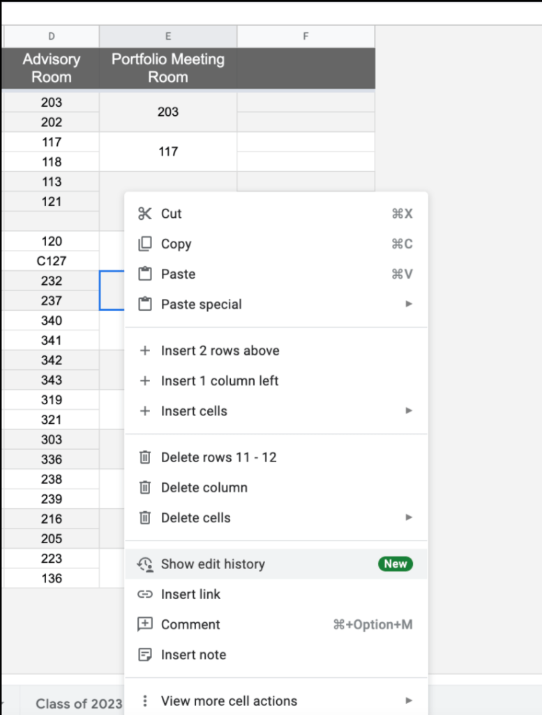
Did you know that you now have the ability to see edit history of particular cells? How to see this history?
- Right click on a cell
- Choose ‘show edit history’
- A small window will appear with any edit history of that cell. You might notice a left/right arrow having you take a look at different versions of just that one cell.
I like that you have the ability to focus on one particular part of the Google Sheet rather than having to sort through everything to find what I are looking for.
THEME COLORS
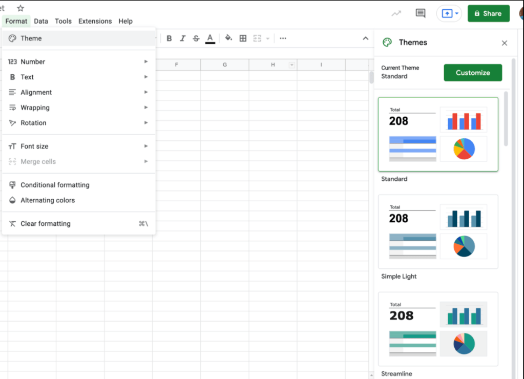
Did you know that you can now change the color scheme of your charts and graphs when working with data? I have gotten accustomed to the traditional blue, and red colors when making graphs in Google Sheets. You no longer have to keep those settings. To make this change
- Select format menu followed by ‘Theme’
- A column of options will then appear on the right side. Choose an option from the list or customize your own
COLUMN STATS
Speaking of graphs, did you know that Google Sheets can give you quick column stats without having to formally create a chart/graph yourself? How to make this happen?
- Highlight the column you are looking for statistical data from
- Select the data menu
- Choose ‘Column stats’
- A column of data will appear on the right. Depending on what you have selected, determines what will show up. You will notice as you hover over certain parts of the data, the actual data is highlighted in the spreadsheet for you to see where the data is coming from. You also can switch the column stats to a different column at the very top.
While you might not use this tool all the time, it could be helpful to get quick data stats. The gif below walks you through the process. This is another great example of having the tool support us in an efficient manner.
If you have any questions, you know where to find me.
And that is my Spiel…
